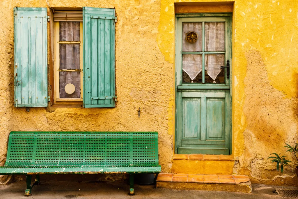
Ochre is a fascinating color that holds a rich history and captures the attention with its unique range of hues. Derived from the Greek word meaning “pale yellow”, ochre is far from being a pale color. It encompasses a spectrum that stretches from light yellow to deep red and brown, even venturing into the realm of violet.
When one thinks of ochre, images of burnt orange and reddish-golden yellows come to mind. This earthy pigment has been used for centuries in various forms of art and decoration. Its warm and vibrant tones evoke a sense of energy and vitality, making it a popular choice for many.
One of the distinguishing characteristics of ochre is its ability to complement other colors. Grey, in particular, is a widely favored pairing for ochre. Light grey can accentuate the vibrancy of ochre, while darker shades of grey lend a more subdued and sophisticated touch.
For those seeking a more dramatic combination, ochre effortlessly complements shades of blue. Whether it be a deep navy or a vibrant turquoise, ochre adds depth and visual interest to any blue-based palette.
The versatility of ochre extends beyond its visual appeal. It has been used throughout history for a variety of purposes. From cave paintings to ancient civilizations, ochre has played a significant role in artistic expression. Its natural pigments have been used in dyes, paints, and even cosmetics.
In addition to its aesthetic qualities, ochre also holds cultural significance. It has been associated with spirituality, symbolizing earth and grounding energies. Many indigenous cultures incorporate ochre in their rituals and ceremonies, using it to connect with the natural world and their ancestral roots.
Today, ochre continues to be embraced in various forms of design and artistic expression. From interior design to fashion, its warm and versatile nature adds a touch of richness and complexity to any space or creation.
Ochre is a captivating color that defies its name of “pale yellow”. With its range of hues spanning from light yellow to deep red and brown, ochre captivates the eye and evokes a sense of energy and vibrancy. Its ability to complement colors such as grey and blue makes it a versatile choice for design and art. Beyond its aesthetic appeal, ochre holds cultural and historical significance, tying us to our ancient past and connecting us to the natural world.
What Color Is Ochre Closest To?
Ochre is a color that is closest to a mixture of orange and red. It falls within the orange color family but leans more towards the red side of pure orange. This burnt ochre shade is a result of combining these two colors, creating a hue that is rich and warm. It is important to note that while ochre is predominantly associated with orange, it does have a strong influence from red, giving it a unique and distinct appearance.
To provide further clarity, here is a breakdown of the color characteristics of ochre:
1. Orange: Ochre has a strong presence of orange in its composition. The vibrant and energetic qualities of orange are evident in ochre, adding warmth and brightness to its overall appearance.
2. Red: Ochre also incorporates elements of red, which contributes to its deeper and more earthy tone. The red undertones in ochre give it a sense of richness and intensity.
3. Burnt: The term “burnt” in burnt ochre refers to the darker and slightly more subdued quality of the color. This burnt aspect adds depth and complexity to ochre, making it a versatile shade that can be used for various purposes.
Ochre can be described as a color that is closest to a blend of orange and red, with a burnt quality that adds depth and richness. Its unique combination of hues makes it a visually appealing and versatile color choice.

Is Ochre Yellow Or Gold?
Ochre is a color that can be both yellow and gold. It belongs to the ochre family, which encompasses a range of colors including various shades of yellow, red, brown, and even purple. The name “ochre” originates from the Greek word for “pale yellow,” but it is important to note that ochre itself can vary greatly in intensity and hue.
When it comes to the specific color gold ochre, it is a distinctive shade that falls within the reddish, golden yellow spectrum. Gold ochre is not a pale yellow, but rather a rich and warm color that resembles the precious metal gold. It is characterized by its reddish undertones, which give it a deeper and more vibrant appearance compared to other shades of ochre.
Ochre can encompass a wide range of colors, but gold ochre specifically refers to a reddish, golden yellow hue.
Is Ochre The Same As Yellow?
Ochre is not the same as yellow. While ochre can include shades of yellow, it encompasses a broader range of colors. Ochre is a natural earth pigment that can vary in hue from pale yellow to deep red and brown. It can even include a violet hue.
Here are some key points to note about ochre:
1. Ochre is a Greek name that means pale yellow, but its color range is much broader.
2. Ochre can range from very light yellow to rich red and brown hues.
3. It can also include a violet color, which is part of the ochre color palette.
4. Ochre is a natural earth pigment and has been used for thousands of years in various forms of art and decoration.
5. The color of ochre can vary depending on the specific minerals and impurities present in the pigment.
While ochre can include shades of yellow, it encompasses a wider spectrum of colors, including red, brown, and even violet.
What Goes With Ochre Colour?
When it comes to pairing colors with ochre, there are several options that can create a harmonious and visually appealing combination. Here are some suggestions:
1. Light Grey: Light grey is a popular choice to pair with ochre as it enhances the vibrancy of the color. The contrast between the two creates a visually striking effect.
2. Dark Grey: If you prefer a more subdued and sophisticated look, pairing ochre with dark grey can be an excellent choice. The combination offers a sense of elegance and refinement.
3. Blue: Ochre complements blue in various shades, making it a dramatic and eye-catching combination. From navy blue to sky blue, the contrast between the two colors can create a visually pleasing and balanced effect.
4. White: Opting for a classic and clean look, pairing ochre with white can create a fresh and modern aesthetic. The crispness of white enhances the warmth of ochre, resulting in a visually pleasing combination.
5. Green: Ochre also pairs well with shades of green. From sage green to olive green, the earthy tones of ochre harmonize beautifully with various green hues, creating a natural and calming ambiance.
6. Brown: For a warm and cozy feel, consider pairing ochre with different shades of brown. From chocolate brown to tan, the combination of these earthy tones can create a welcoming and comforting atmosphere.
When choosing colors to pair with ochre, light grey and dark grey can offer contrasting effects, while blue can add a dramatic touch. White creates a fresh and modern look, green brings a natural ambiance, and brown adds warmth and coziness. Experiment with these color combinations to find the one that best suits your aesthetic preferences.

Conclusion
Ochre is a unique and versatile color that originates from the Greek word for pale yellow, although it can range from light yellow to rich red, brown, and even purple hues. Despite its name suggesting a pale tone, ochre is anything but pale. It is a vibrant and bold color that adds warmth and depth to any space. Ochre pairs well with various colors, including grey, which can either bring out its vibrancy or offer a more subdued and sophisticated look. Additionally, ochre complements shades of blue, allowing for dramatic and eye-catching combinations. Whether used in interior design, fashion, or art, ochre adds a touch of character and richness to any palette.
