Color is an integral part of our lives, influencing our emotions, moods, and perceptions. It is used for expressing and conveying different messages, and it plays a crucial role in various aspects of our lives, including fashion, art, design, and advertising. One of the most interesting aspects of color is its ability to complement other colors, creating visually appealing and harmonious color schemes. In this article, we will explore the concept of complementary colors and answer the question of whether black is a complementary color.
Complementary colors are pairs of colors that are opposite each other on the color wheel. These colors create a high-contrast and visually striking effect when used together. The most common complementary color pairs are red and green, blue and orange, and yellow and purple. When these colors are used together, they create a bold and energetic color scheme that demands attention.
However, black is not usualy considered a complementary color. Black is the absence of all colors and is often used as a neutral color to complement other colors. It is a versatile color that can be used in many different color schemes, but it is not typically paired with another color as a complement.
Instead, black is often used to create a sense of contrast and drama in a color scheme. It can be used to make other colors stand out, or it can be used to tone down bright colors. For example, a bright yellow can be toned down by pairing it with black, creating a more sophisticated and elegant look.
While black is not typically considered a complementary color, it can still play an important role in creating visually appealing and harmonious color schemes. Its versatility and ability to complement other colors make it an essential color in fashion, art, and design. Whether used as a neutral backdrop or to create a sense of drama and contrast, black is a color that will continue to be an important part of our lives.
What Are Complementary Colors?
Complementary colors are pairs of colors that are located opposite each other on the color wheel. These colors are known for creating a high level of contrast when placed next to each other, which can make them visually striking and attention-grabbing. Some of the most common complementary color pairs include red and green, yellow and purple, and orange and blue. Other complementary color pairs include green and magenta, blue-green and red-orange, and yellow-green and red-purple. By using complementary colors in design and art, you can create bold and dynamic compositions that are sure to catch the eye.

Source: mydomaine.com
Complementary Colors to Black
There are several complementary colors to black. Complementary colors are colors that are opposite each other on the color wheel, and when used together, they can create a striking contrast. The complementary color to black is white, which is the absence of all color.
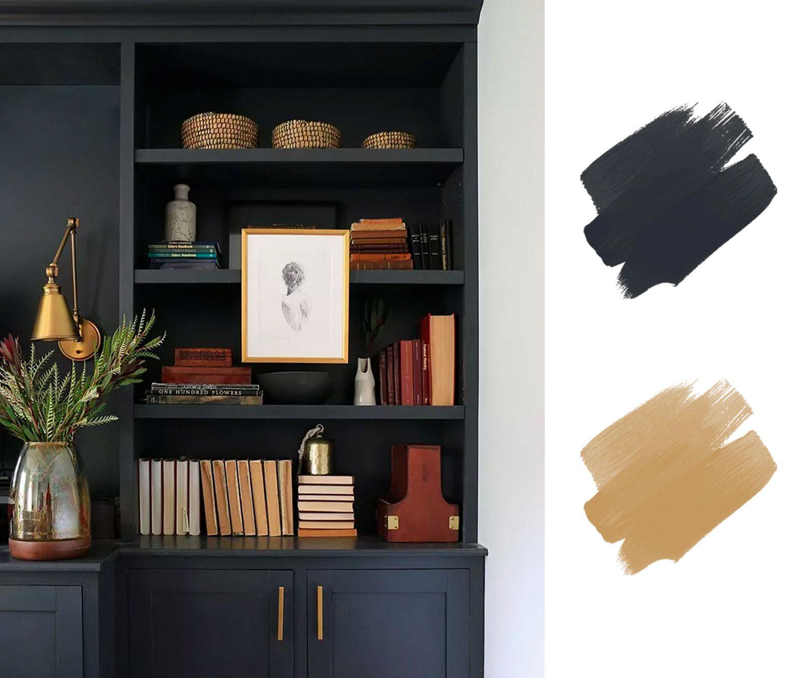
However, if you’re looking to add some color to black, there are several options that can complement it nicely. Lighter browns, such as beige and tan, can help black stand out and create a sophisticated look. Additionally, muted shades of red, such as terracotta or rust, can bring a calming pop of color to black without being too overwhelming.
Other complementary colors to black include shades of gray, navy blue, and even certain shades of green or purple. When choosing a complementary color, it’s important to consider the mood and style you’re tryng to create. For example, a bold, bright color like hot pink might not be the best choice for a sophisticated, minimalist look, but could be a great choice for a more playful and whimsical style.
While white is the traditional complementary color to black, there are several other options that can complement it nicely and create a striking contrast. Lighter browns, muted reds, shades of gray, navy blue, and certain shades of green or purple can all be great choices for complementing black.
Are White and Black Complementary Colors?
When it comes to color theory, complementary colors are those that are located directly across from each other on the color wheel. These pairs of colors tend to create a strong contrast and work well together in many different contexts. However, while black and white are often used together in design and art, they are not considered to be complementary colors in the traditional sense.
This is because black and white are actually considered to be neutral colors, rather than true colors in the way that red, blue, or yellow are. Neutral colors are those that do not appear on the color wheel and are created by mixing different combinations of colors together.
While black and white can certainly be used together to create interesting visual effects, they do not have the same relationship to each other that complementary colors do. Instead, black and white are often used to create contrast or to balance out other colors in a design.
To summarize, while black and white are often used together in design and art, they are not considered to be complementary colors according to traditional color theory. Instead, they are neutral colors that can be used to create contrast and balance in a variety of different contexts.
Complementary Colors: A List of 12
Complementary colors are pairs of colors that are opposite each other on the color wheel. When paced next to each other, they create a strong contrast and enhance each other’s intensity. The 12 split-complementary color schemes are variations of the complementary color scheme, which uses two colors that are opposite each other on the color wheel.
The 12 split-complementary color schemes include:
1. Red, Yellow-green, Blue-green
2. Red-orange, Green, Blue
3. Orange, Blue-green, Blue-purple
4. Yellow-orange, Blue, Purple
5. Yellow, Blue-purple, Red-purple
6. Yellow-green, Purple, Red
7. Green, Red-purple, Red-orange
8. Blue-green, Red, Orange
9. Red, Yellow-green, Blue-green
10. Red-orange, Green, Blue
11. Orange, Blue-green, Blue-purple
12. Yellow-orange, Blue, Purple
In each split-complementary color scheme, one color is paired with the two colors adjacent to its complementary color. For example, in the first scheme, red is paired with yellow-green and blue-green, which are next to green, the complementary color of red.
Using split-complementary color schemes can add depth and interest to your designs, as they offer a wider range of colors than traditional complementary color schemes. When choosing colors for your project, consider using one of these 12 split-complementary schemes to create a harmonious and eye-catching color palette.

Conclusion
Color is a powerful tool that can evoke emotions, create moods, and communicate messages. Understanding color theory and how different colors interact with each other can help individuals make informed decisions when it coes to fashion, interior design, and branding. Complementary colors, such as red and green or blue and orange, can create a high-contrast and eye-catching color scheme, while analogous colors, such as yellow and green or blue and purple, can create a harmonious and calming effect. Split-complementary colors, like red-orange, green, and blue, offer a unique twist on the complementary color scheme. Ultimately, the use of color is subjective and personal, and individuals should feel empowered to experiment and express themselves through the use of color.
