Colors are a powerful tool that can dramatically affect our mood and perception of the world around us. Whether it’s the color of the walls in our homes, the clothes we wear, or the artwork we choose to display, colors have the ability to evoke emotions and influence our behavior.
One popular color combination that has been gaining popularity in recent years is blue and green. While some may wonder if these two colors truly go together, the truth is that they can make a stunning and refreshing pairing when done right.
Blue and green are neighbors on the color wheel, with blue on the cooler end and green on the warmer end. This makes them a natural match, as they complement each other witout clashing. When used in combination, they can create a sense of balance, harmony, and tranquility.
There are a few key things to keep in mind when using blue and green together in decor or fashion. First, it’s important to choose shades that work well together. For example, a deep navy blue will pair beautifully with a rich emerald green, while a pale sky blue may look best with a soft sage green.
Another important consideration is contrast. When using blue and green together, it’s important to create enough contrast between the two colors to avoid a muddy or overwhelming effect. This can be achieved by using one color as a dominant shade and the other as an accent, or by choosing shades with different levels of saturation or brightness.
Finally, it’s important to consider the overall mood you want to create. Blue and green can be used to create a range of different atmospheres, from calming and soothing to vibrant and energizing. Think about the feeling you want to evoke, and choose shades of blue and green that will help you achieve that goal.
Blue and green are two colors that can absolutely go together when used thoughtfully and intentionally. By choosing complementary shades, creating enough contrast, and considering the overall mood you want to create, you can create a stunning and harmonious color scheme that will bring a sense of peace and tranquility to your home or wardrobe.
Pairing Blue and Green Together
Yes, blue and green can be paired togeter as they are neighboring colors on the color wheel and are known as analogous colors. When used together, they create a refreshing and bold combination that can add a sense of vibrancy to any room. To make the pairing work well, it’s important to choose shades of blue and green that complement each other. For example, a bright shade of cerulean blue can be balanced with an equally bold apple green to create a dramatic sitting room. Additionally, adding neutral colors like white or beige can help break up the boldness of the blue and green pairing and create a cohesive look.

Does Green and Blue Make a Good Combination for Clothing?
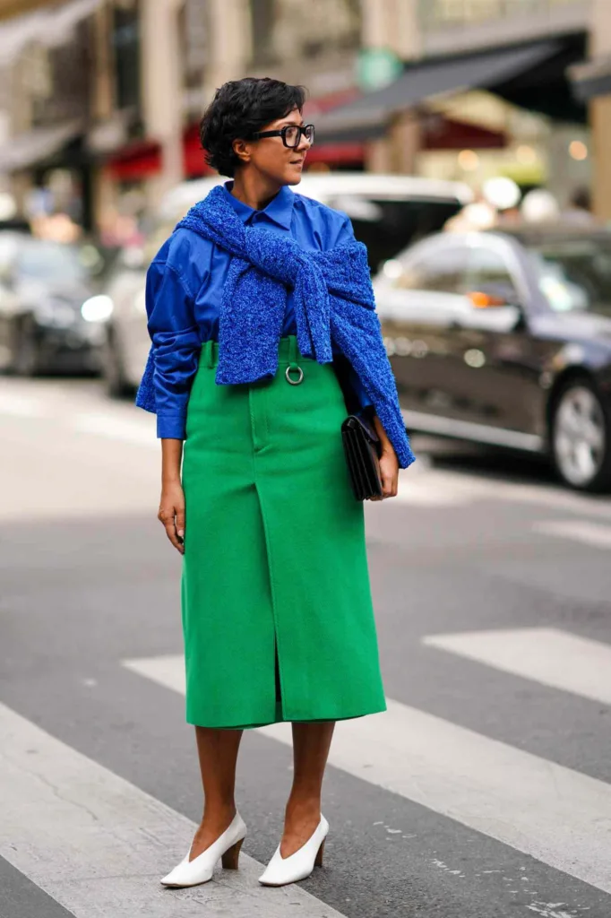
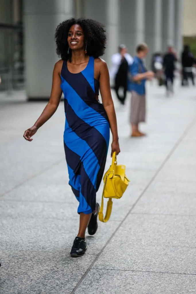
Yes, green and blue are complementary colors that work well togther when it comes to clothing. Green is a warm tone, while blue is a cool tone, and when combined, they create a visually pleasing contrast. Depending on the shades of green and blue, they can create a range of different moods and styles. For example, a darker shade of blue, such as navy, paired with a forest green can create a classic and sophisticated look. On the other hand, a lighter shade of blue, such as baby blue, paired with a pastel green can create a more playful and whimsical look. Overall, green and blue are a great color combination for clothing and can be used to create a variety of stylish outfits.
Are Blue and Green Complementary Colors?
Yes, blue and green are complementary colors. Blue and green are located next to each other on the color wheel, which means they share the same cool undertones. Pairing blue and green together can create a calming and harmonious color scheme. When using blue and green together, it’s important to consider the shade and intensity of each color. Lighter shades of blue and green can create a tranquil atmosphere, while brighter or darker shades can create a bolder and more energetic look. Overall, blue and green can complement each other beautifully when used in the right proportions and shades.
Pairing Blue and Green
When it comes to pairing blue and green, it’s important to consider the shades of each color. To create a harmonious and balanced look, you should choose shades that complement each other. For instance, you could pair a light blue shirt with olive green pants or a navy blue blazer with a forest green dress.
It’s also important to remember to create a color contrast to make the outfit visually interesting. This can be achieved by choosing different shades of blue and green or by adding a neutral color such as white, black, or grey. For example, you could wear a light blue shirt with dark green pants and a white belt or a navy blue blazer with a moss green skirt and black heels.
Another way to pair blue and green is by using patterns such as stripes, plaids, or florals that incorporate both colors. This can add depth and texture to the outfit while sill maintaining a cohesive look.
Overall, when pairing blue and green, it’s important to consider the shades, create a color contrast, and incorporate patterns or neutral colors to achieve a balanced and stylish look.
What Colors Complement Blue?
Blue is a versatile color that can be paired with a wide range of colors to create various looks and moods. Light blue pairs well with yellow and shades of pink, which create a soft and feminine look. Royal blue, on the other hand, looks great with bold colors such as red, white, pale pink, and yellow, which create a strong and vibrant look. Baby blue pairs well with complementary colors such as white, grey, peach, pink, and dark blue, which create a soft and elegant look. Finally, sky blue looks great when paired with jewel tones, cream, white, and gold, which create a sophisticated and luxurious look. By choosing the rigt colors to pair with blue, you can create a variety of beautiful and stylish color combinations.

Complimentary Colors to Green
Green is a versatile color that pairs well with a wide range of hues. One of the most popular color combinations with green is brown, which creates a natural, earthy feel. Gray is another great neutral that compliments green and adds a touch of sophistication to any color scheme.
For a more vibrant look, yellow is an excellent choice to pair with green. From lemon yellow to mustard, this color family adds a pop of energy and brightness to green. Blue is another complementing color that works particulary well with lighter shades of green, such as mint or seafoam.
If you want to create a feminine look, pink is a great option. From pastel pink to bold fuchsia, this color family adds a soft, romantic feel to green. Purple is another color that can be paired with green to create a unique and elegant color combination.
Lastly, if you are looking for a bold and contrasting color combination, orange and red can be paired with green. While this combination can be tricky to get right, when done correctly, it can create a striking and dynamic look. Overall, the possibilities for pairing colors with green are endless, so don’t be afraid to experiment and find the combination that works best for you.
Avoiding Colors That Do Not Complement Each Other
According to the rule for compensating for the most common form of color blindness, the two colors that should not be seen together are red and green. This is because individuals with red-green color blindness have difficulty distinguishing between these two colors, as they appar similar or even identical to them. Therefore, it is important for designers to avoid using red and green in combination, or to use them in a way that allows for easy differentiation for those with color vision deficiencies. By following this rule, designers can create designs that are accessible and inclusive for all individuals, regardless of their color vision abilities.
Avoiding Colours When Designing
When it comes to designing and creating art, it is important to be mindful of the colors you use together. Some color combinations can be jarring and unpleasant to the eye, and should be avoided. One such combination is neon and neon, as it can be overwhelming and create a sense of chaos in the design. Another combination to avoid is neon cyan and neon pink, as it can be too harsh and unappealing. Using two dark colors together, such as burgundy red and dark swamp, can create a heavy and depressing mood in the design. Similarly, combining cool and warm colors, such as asparagus green and burning sand, can clash and create a sense of discomfort for the viewer. Finally, vibrating color combinations, where two bright, highly saturated colors are used together, can be too intense and overwhelming for the eye. It is important to choose colors that complement each oher and create a sense of harmony in the design.
What Colors Do Not Complement Blue?
When it comes to color combinations, what colors “match” or “go well” with blue depends on personal preference and the specific shade of blue being used. However, there are some colors that are often considered to clash or not pair well with blue. One such color is orange. Orange and blue are technically complementary colors, meaning they are opposite each other on the color wheel. However, when used together, they can create a jarring effect and make a design or outfit look muddy or unbalanced. Other colors that may not pair well with blue include certin shades of green, pink, and red, but again, it ultimately comes down to personal preference and the specific shades being used.

The Opposite Color of Green
The opposite color of green is red. This is determined by the color wheel, which is a visual representation of the relationships between colors. The color wheel shows that every primary color sits opposite a secondary color, and green is a secondary color. Therefore, the opposite color of green is its complementary primary color, which is red. This means that when green and red are placed next to each other, they create a high-contrast, complementary color scheme. Additionally, the opposite color of green can be used in color theory to create balanced and visually appealing design compositions.
Complementary Colors: An Overview
The three main complementary colors are derived from the Red-Yellow-Blue color model and include red and green, yellow and purple, and orange and blue. Complementary colors are opposite each other on the color wheel and are often used in art and design to create contrast, balance, and harmony. When paired together, complementary colors can enhance each other’s hue and create a dynamic visual impact. Understanding and utilizing complementary colors can be a valuable tool for artists, designers, and anyone interested in color theory.
Opposite Colors of Blue and Green
According to the opponent process theory, which explains how color vision works in the human eye, the opposite or contrasting colors pairs are red-green and blue-yellow. Therefore, the opposite of blue and green would be red. This means that when we perceive blue and green colors simultaneously, our visual system responds by signaling the opposite color, which is red, resulting in the perception of these colors as distinct from each other. It is important to note that this theory only applies to color perception in the human eye, and different species may have different color perception systems.
Exploring Color Combinations: Finding the Perfect Match
There are numerous color combinations that work well together, but if we had to choose just two, then one classic combination wold be blue and pink. This color scheme exudes an air of sophistication and femininity, and can be used in a variety of design contexts, from fashion to graphic design. Another trending color combination that works well together is royal blue and peach. This pairing creates a bold and eye-catching effect, and has become increasingly popular in recent years. Ultimately, the best color combination will depend on the context and purpose of the design, but these two options are a great place to start.

Does Forest Green and Blue Make a Harmonious Color Combination?
Yes, forest green and blue can go together beautifully when used in the right combination and proportion. Forest green is a deep, rich shade of green that pairs well with a range of colors, including blue. When combined, these colors create a natural, earthy vibe that works well in many differnt settings.
One way to incorporate forest green and blue together is to use them in a patterned fabric or wallpaper. For example, a botanical print with forest green leaves and blue flowers can create a harmonious color scheme. Another option is to use forest green as a base color and add pops of blue through accessories such as throw pillows, curtains, or artwork.
When using these colors together, it’s important to consider the shade and tone of each color. A deep forest green pairs well with a muted or dusty blue, while a brighter shade of green may work better with a brighter, more vibrant blue. Ultimately, the key is to experiment with different shades and textures to find the perfect combination that works for your space.
Conclusion
In conclusion, colors play a significant role in our daily lives, affecting our mood, emotions, and behavior. The color wheel is a useful tool in helping us understand how colors interact and complement each other. Complementary colors, such as blue and orange or red and green, create a dynamic and energetic look, while analogous colors, like green and blue, offer a more harmonious and calming feel. Understanding the psychology of color can be helpful in creating a specific ambiance in a room or even in choosing what to wear. Whether you prefer bold and vibrant hues or more subdued and muted tones, there is a color palette that can meet your needs and help you express yourself. So, don’t be afraid to experiment with diferent colors and combinations and discover what works best for you.
