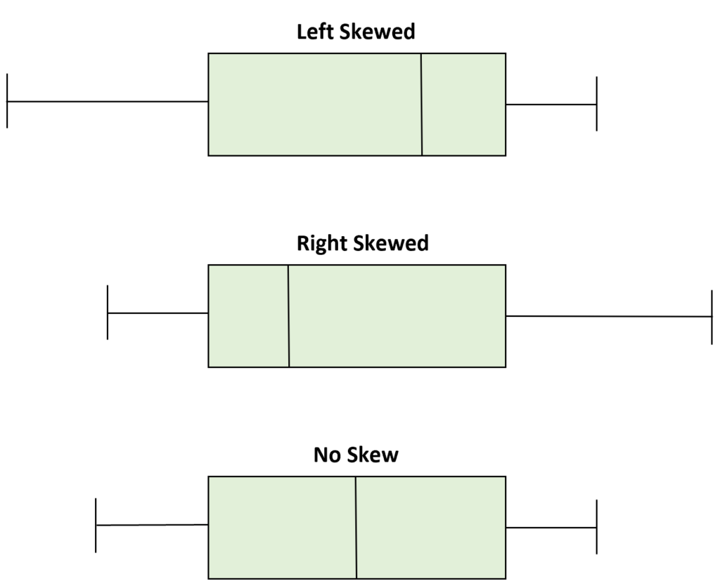
A box plot is a graphical representation of data that shows the distribution of values in a dataset. It is also known as a box and whisker diagram. The box plot consists of five different components: the minimum, lower quartile, median, upper quartile, and maximum. It provides an easy way to visualize the spread and shape of data.
In addition to showing the spread and shape of data, a box plot can also show whether a dataset is skewed left or right. This important information can help you interpret your data more accurately. A right-skewed box plot indicates that most of the values are concentrated in the lower end of the dataset, while a left-skewed box plot indicates that most of the values are concentrated in the higher end.
Right skew (also called positive skew) means that there are more values at the low end and fwer at the high end; this creates a tail on the right side extending beyond the highest value. Left skew (also called negative skew) means that there are more values at the high end and fewer at the low end; this creates a tail on the left side extending beyond the lowest value.
The shape of your box plot will also tell you whether there are any outliers present in your dataset, as outliers may cause skewness even when there isn’t any inherent bias in your data distribution. Outliers are extreme values that are much higher or lower than other values in your dataset; these can be easily identified by their distance from other points on your chart.
Understanding how data is distributed and whether it is skewed to either side or not can help you make better decisions when analyzing your results. A box plot gives an easy visual representation of this information so you don’t have to calculate individual values each time you need to know how your data is distributed.
Identifying Skew in a Box Plot
A box plot provides a visual representation of the distribution of data. To tell if a box plot is skewed right or left, you must first look at the position of the median relative to the mean. If the median is lower than the mean, it indcates that the box plot is skewed to the right (positive skewness). Conversely, if the median is higher than the mean, it indicates that the box plot is skewed to the left (negative skewness). Additionally, you can look for outliers in order to determine whether a box plot is skewed. Outliers are points that lie outside of 1.5 times IQR (interquartile range) which can indicate either right or left skewness.

The Meaning of a Right-Skewed Boxplot
A boxplot that is skewed to the right means that the majority of the values in the data set are small, but there are a few exceptionally large values. This causes the right side of the boxplot (the upper quartile and maximum value) to extend further out than the left side (the lower quartile and minimum value). This indicates that while most of the data is concentrated around a smaller range, there are some larger values that cause an imbalance in the distribution.
Understanding Skewed Right and Skewed Left Distributions
Skewed right and skewed left are terms used to describe the shape of a data set or distribution. A right-skewed distribution, also known as a positively skewed distribution, is one in which the values on the right side of the peak are higher than those on the left. This means that most of the data is concentrated on the right side of the peak, with fewer values on the left. The graph of a right-skewed distribution will look like an asymmetrical “smile” shape.
Conversely, a left-skewed distribution, also known as a negatively skewed distribution, is one in which values on the left side of the peak are higher than those on the right. This means that most of the data is concentrated on the left side of the peak, with fewer values on its right. The graph of a left-skewed distribution will look like an asymmetrical “frown” shape.
Together, these two distributions help us understand how different groups of data may be distributed acoss various categories or variables. By recognizing how these distributions differ from one another and how they interact with other distributions and variables, we can gain valuable insight into patterns in our data sets and draw meaningful conclusions from them.
Identifying Skewed Graphs
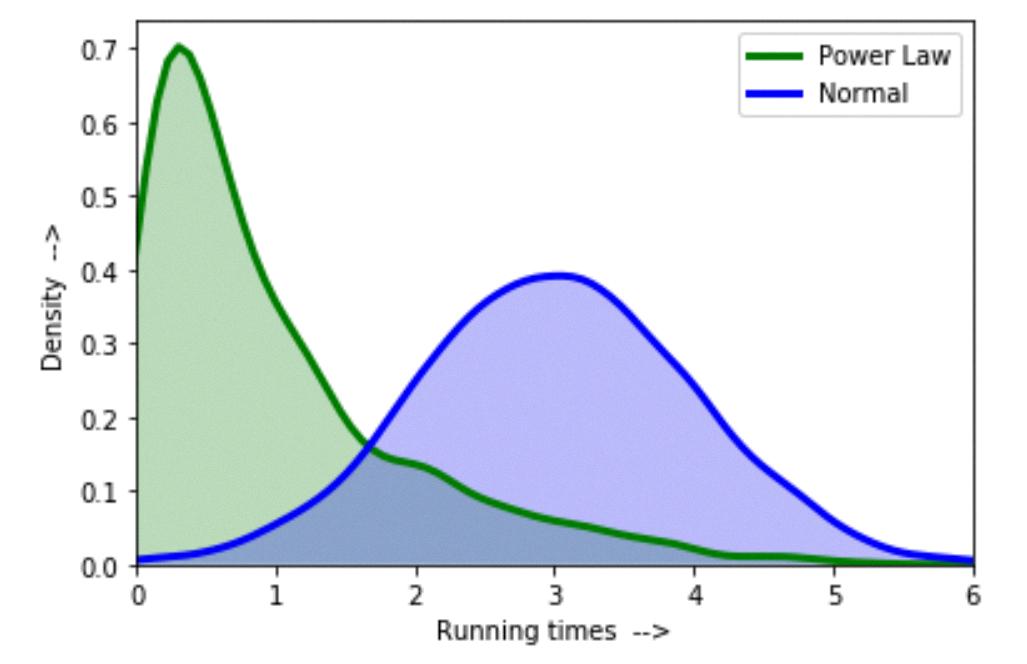
When looking at a graph, you can tell if it is skewed left or right, or symmetric by observing the shape of the data. If the graph has a longer tail on the left side than on the right, then it is skewed left; if it has a longer tail on the right side than on the left, then it is skewed right; and if both tails are equal in length, then the graph is symmetric. Another way to tell if a graph is skewed left or right is to compare the mean and median values. If the mean vaue is lower than the median value, then it is skewed to the left; if the mean value is higher than the median value, then it is skewed to the right; and if they are equal, then it is symmetric.
Identifying a Left Skewed Distribution
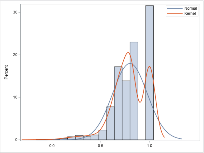
To determine if your data is left skewed, you will need to compare the shape of your data’s distribution to a normal distribution. If you find that your data has a longer tail on the left side (the side with the smaller values), then it is likly that your data is left skewed. Additionally, you can calculate measures such as the mean and standard deviation of your data, and compare them to what they would be in a normal distribution. If the mean of your data is smaller than the mean of a normal distribution, and if the standard deviation of your data is larger than the standard deviation of a normal distribution, then this further indicates that your data may be skewed left.

Source: geeksforgeeks.org
The Difference Between Mean and Median in Skewed Left Distributions
A skewed left distribution means that the values are clustered more towards the lower end of the range, with fewer values the further away from that low end. In this type of distribution, the mean is typically less than the median, which is often less than the mode. This is because a skewed left distribution has a few large outliers on the higher end of the range, which can pull up the mean but not affect the median and mode as significantly.
Understanding Skewed Right Data
A right-skewed distribution tells us that the majority of values lie to the left of the mean and that there are a few extreme values to the right of the mean. This means that the data is not evenly distributed around the mean, but rather it is concentrated towards one side. A right-skewed distribution often looks like a skewed bell curve with most values concentrated on the left side. The median in this case will be greater than the mean because it is not affected by extreme values on one side of the data set.
Interpreting Skewness on a Box Plot
Skewness on a box plot is a measure of the asymmetry of the data. It is calculated by comparing the median (the middle point of the box) to the mean (the average of all values). If the median is greater than the mean, then the data is said to be positively skewed (or right-skewed), meaning that there are more large values than small values. On a box plot, this would appear as a longer right-hand whisker, and the median would be closer to that side. If the median is less than the mean, then the data is said to be negatively skewed (or left-skewed), meaning that there are more small values than large values. On a box plot, this would appear as a longer left-hand whisker and the median would be closer to that side. Skewness can povide valuable insight into understanding how your data is distributed and help you identify any potential outliers or anomalies in your data set.
Interpreting a Right Skew
If a data distribution is “skewed right,” it means that the majority of the data points lie near the left side of the distribution, while there are fewer points further out on the right side. This results in a tail that extends out to the right side of the graph, creating an asymmetrical shape. The degree to which a distribution is skewed right can be measured by calculating its skewness coefficient. A positive coefficient indicates that it is skewed right, while a negative coefficient would indicate that it is skewed left. Skewed right distributions ofen occur when there are outliers or extreme values on the high end of the data set.

Analyzing Skewed Data
To analyze skewed data, we can first identify the skewness of the data by calculating its skewness statistic. This statistic is calculated as the third standardized moment of a distribution and measures the asymmetry of the data. A negative value indicates a left-skewed distribution, with more values on the left side than on the riht side. A positive value indicates a right-skewed distribution, with more values on the right side than on the left side. We can also use visual methods such as histograms or box plots to detect skewness in our data.
Once we have identified that our data is skewed, we can use various methods to correct this skewness. If our data is left-skewed, then we can take a square root or log transformation to make it more symmetrical and easier to analyze. If our data is right-skewed, then we could apply an inverse transformation such as raising each value to a power greater than one.
Finally, once our data has been made less skewed, we can analyze it using standard techniques such as linear regression or other machine learning algorithms. By making sure that our data is not heavily skewed before running these algorithms, we can ensure that our results are accurate and reliable.
What Direction Does Positively Skewed Represent?
Positively skewed means that the tail of the distribution is longer or fatter on the right side. This means that the majority of values in the data set are concentrated on the left side, but there are a few extreme values on the right side that drag up the mean and skew the data to one side. If you plot this data out, you will see a curve that looks like a hump on the right side.
Mean vs. Median: Which is Skewed Right?
When data is skewed to the right, the mean (average) will usually be greater than the median. This is because when data is skewed to the right, tere are more values on the right side of the distribution that are higher than the median, so these values pull the mean up. On the other hand, when data is skewed to the left, there are more values on the left side of the distribution that are lower than the median, so these values pull down on the mean. In symmetric distributions, we expect both measures to be approximately equal in value.
Identifying the Direction of a Graph
To determine if a graph will shift left or right, you must look at the value of the constant k. If the constant k is positive, then the graph will shift left. If the constant k is negative, then the graph will shift right. For example, if you have a function f(x) and you define a new function g(x) as g(x)=f(x+k), were k is a positive number, then the graph of g(x) will shift left compared to the graph of f(x). Similarly, if you define g(x)=f(x+k), where k is a negative number, then the graph of g(x) will shift right relative to that of f(x).
Identifying Symmetric and Skewed Distributions
To determine if a distribution is symmetric or skewed, we need to compare the mean, median, and mode of the data set. If the mean equals the median, which also equals the mode, then the distribution is symmetric. However, if any of these values differ from one another then the distribution is skewed. A skewed distribution can be either positively or negatively skewed depending on whether the mean is greater than or less than the median. Positively skewed distributions have a longer tail on the right side while negatively skewed distributions have a longer tail on their left side.
Identifying a Distribution as Left or Right
To determine wether a distribution is left or right, you can look at the shape of the data. A distribution is left-skewed, or negatively skewed, if the mean is to the left of the median and most of the data points are clustered on the right side of the graph. Conversely, a distribution is right-skewed, or positively skewed, if the mean is to the right of the median and most of the data points are clustered on the left side of the graph. You can also calculate skewness, which is a measure of asymmetry in a statistical distribution that tells you whether it’s symmetrical, positively skewed (right-skewed), or negatively skewed (left-skewed). If skewness is greater than zero then it indicates that your data is positively skewed; if skewness is less than zero then it indicates that your data is negatively skewed.
Conclusion
The box plot is a powerful tool for visualizing the distribution of a dataset. It is useful for identifying outliers, understanding the shape of the data, and comparing distributions between different groups. The box plot consists of five components: a box, two lines (the median and upper and lower quartiles), whiskers that extend out to the highest and lowest values, and any additional points or outliers. By looking at thse components, it is possible to determine if the data is skewed or symmetrical. Furthermore, it can be used to compare different distributions in order to gain insight into how they differ from one another. Ultimately, the box plot is a useful tool for quickly gaining insights into a dataset.
