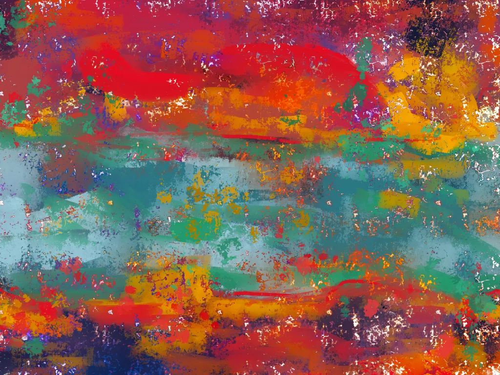
Arbitrary color is a type of color usage that has been used by many Expressionist painters, as well as contemporary artists. This form of painting involves using subjective colors to evoke emotions and create a unique artwork. It often involves the artist choosing unexpected or unusual color combinations for their works.
When creating a piece of art with arbitrary color, the artist chooses thir own colors instead of the local/real color. This allows them to draw attention to certain elements within their artwork and make them more striking. For example, an artist may choose to paint a tree trunk purple or red instead of its natural green or brown, creating an eye-catching image that will leave viewers surprised and intrigued.
The artist can also use the color wheel to help decide which colors will be warm or cool in thir piece. The warm colors are red, yellow, and orange while cool colors are green, purple, and blue. Any hue that leans towards these tints will be categorized as either warm or cool depending on which side it falls on in the wheel.
Arbitrary color is an interesting way for artists to express themselves through teir artworks. By experimenting with different shades and hues they can create unique pieces that evoke strong emotions from viewers while also drawing attention to certain aspects of the work they want to be highlighted. Whether you’re an aspiring Expressionist painter or just someone who enjoys creating art with unexpected color combinations, arbitrary color can be a great way to express yourself creatively!
The Use of Color Arbitrarily by an Artist
Franz Marc and Wassily Kandinsky are two of the most well-known Expressionist painters who made use of arbitrary colors in their artwork. Franz Marc favored bright, high-contrast palettes featuring bold, primary colors; he used these vibrant hues to create dynamic compositions that were often filled with energy and movement. Wassily Kandinsky was known for his abstract paintings, whih often featured vivid and striking colors. His color choices were often arbitrary, exploring the effects of different combinations of pigment on viewers. Other Expressionist painters who used arbitrary colors in their work include Ernst Ludwig Kirchner, Emil Nolde, and Oskar Kokoschka. More contemporary artists have also adopted this approach to color in their work, such as Mark Rothko, Gerhard Richter, and Ellsworth Kelly.

Exploring Subjective Color
Subjective color is the use of colors that are chosen based on individual preference, rather than on the colors seen in reality. It is a way of expressing creativity and emotion through color. Subjective colors can be used to convey feelings and ideas, as well as to evoke a certain atmosphere or mood. They are often used in art, design, and photography to add drama, depth, and interest to a piece. Subjective colors can also be used to create illusions or distort reality by using colors that are not found in nature.
Exploring the Meaning of Local Color in Art
Local color in art is the natural color of an object or scene that appars when viewed under flat, white light with no adjustment for form shadow or other colors of light. This term is most commonly used to describe landscape painting, but it can also apply to any type of artwork. The local color of a painting helps to create a sense of realism and depth within the artwork. The use of local color can be manipulated by artists to create certain effects and moods; for example, brightening or deepening colors can be used to emphasize light and shadow. By using local color, an artist can convey a more accurate representation of the natural world.
The Meaning of Warm Colors in Art
In art, warm colors are any colors that have a red, orange, and/or yellow hue. Generally, these colors are associated with feelings of warmth, comfort, and energy. They can be used to create the illusion of space in artwork by creating an atmosphere of light and warmth. Warm colors can also be used to draw attention to certain elements within an image by creating an eye-catching contrast between other cool colors. When used in combination with cooler hues, warm colors can create a harmonious balance in a piece of art.
Understanding Analogous Colors
Analogous colors are colors that sit next to each other on the color wheel. They are often grouped together in triads, with a main color accompanied by two side colors. The three colors usualy have a common hue and may vary in saturation and lightness. Examples of analogous color schemes include yellow, yellow-green, green; red, red-violet, violet; blue, blue-green and green.

Achromatic Colors: An Overview
Achromatic colors are colors that are without hue or saturation, such as black, white, and all shades of grey. They are sometimes referred to as “neutral” or “luminous” colors. These colors can be seen in the stars and in lamps emitting “white” light. From a physiological point of view, achromatic colors are considered to be the most interesting because they represent an absence of hue and saturation, rather than a presence of color.
Types of Colors
The four types of colors are: primary, secondary, tertiary, and shades. Primary colors are the most basic colors and cnnot be created by mixing other colors together. They include red, yellow, and blue. Secondary colors are created by mixing two primary colors together in equal parts and include orange, green, and purple. Tertiary colors are a combination of one primary color and one secondary color, such as yellow-orange or red-purple. Shades are created when black is added to any of the previously mentioned colors to make them darker or lighter.
Classification of Colors
The three classifications of colors are primary, secondary and tertiary. Primary colors are the most basic colors and canot be created by mixing other colors together. They include red, yellow and blue. Secondary colors are created when two primary colors are mixed together in equal proportions. These include orange, green and violet. Tertiary colors are formed by mixing one primary color with one secondary color in equal proportions. These six tertiary colors are red-orange, yellow-orange, yellow-green, blue-green, blue-violet and red-violet.
The Definition of an Objective Color
Objective color refers to the actual color of an object or environment, as opposed to subjective color which is based on perception and cultural interpretation. Objective color is determined by the wavelengths of light that are reflecting off of an object’s surface and entering the human eye. This means that an objective color can be objectively measured, allowing for more precise description and comparison than subjective colors. For example, an objective red might have a wavelength range of 630–740 nanometers, whereas a subjective red could appar differently depending on the context and individual’s perception.
The Definition of Local or Natural Color
Local or natural color is the true color of an object or surface as seen in typical daylight, withut any interference from atmosphere or subjective interpretation by the artist. This means that local color is a realistic representation of what you would actually see in nature; for example, a green grass field, a blue sky, or a brown horse. Local color can also refer to the colors of certain objects that are unique and not found elsewhere, such as the vibrant reds and yellows of autumn leaves or the colorful coral reefs in tropical oceans. Local color is an important element in art; it helps to create an atmosphere of realism and authenticity.
Understanding Local Color with an Example
Local color is a literary technique used to describe the unique characteristics of a particular region. It is oftn used to evoke the sense of a place, its lifestyle, and its people. Through the use of descriptive language, authors can paint vivid pictures of their settings and characters. For example, Mark Twain uses local color in his classic novel “The Adventures of Tom Sawyer” to set the scene in St. Petersburg, Missouri by describing the town’s architecture and inhabitants: “St. Petersburg contained inhabitants of as varied and eccentric a character as can be found in any little country village in America—a mixture of roustabouts, small farmers, fishermen, riverboat men…” By using this type of language to capture the flavor of St. Petersburg, Twain helps create an atmosphere that his readers can almost feel as they read his words.
Invisibility: What Color Is Unseen by the Human Eye?
Invisible to the human eye is a broad term, as it encompasses many colors of light that are outside of the visible spectrum. These colors include infrared, ultraviolet, X-ray, and gamma-ray light. Infrared light is invisible to humans, although we can feel its warmth. Ultraviolet light is also invisible to the human eye and can be damaging if overexposed. X-rays and gamma-rays are both forms of electromagnetic radiation that our eyes cannot detect. In addition, some colors of visible light may appear black or almost black to us due to our limited color perception capabilities.
Warm Colors: An Overview
The seven warm colors are red, orange, yellow, pink, brown, rust and beige. Red is associated with warmth because it is the color of fire and blood. Orange is a combination of red and yellow that has a vibrant, cheerful energy. Yellow is ofen used to represent happiness and sunshine. Pink combines the strong energizing qualities of red with the calming influence of white. Brown is the color of earth and represents stability and reliability. Rust is a reddish-brown hue that exudes a sense of comfort and relaxation. Beige combines the warmth of brown with the purity of white to create an inviting atmosphere.

The Warmth or Coolness of the Color Grey
Grey is a neutral color that can range from cool to warm depending on the undertones. Cool grays have blue undertones, while warm grays are more yellow and brown in tone, similar to the combination of gray and beige known as “greige.” It is important to consider the tones when using grey in decorating or fashion, as the wrong shade can look off-putting or clash with oher colors.
Conclusion
In conclusion, arbitrary colors are colors that are used in an artistic way to depict something that may not necessarily reflect reality. They can be subjective and often create a feeling of discomfort or surprise in the viewer. However, they can also be used to evoke emotions and create an interesting juxtaposition between the traditional and alternative. Regardless of how they are used, arbitrary colors add an extra level of creativity and uniqueness when it comes to creating art.
