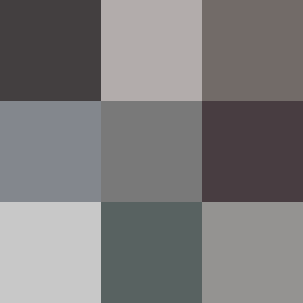
Colors play a significant role in our daily lives, influencing our moods, emotions, and perceptions. They can evoke different feelings and sensations, from excitement and happiness to calmness and relaxation. While bright and vibrant colors are often associated with energy, enthusiasm, and joy, dull colors have their own unique charm and appeal.
Dull colors, also known as muted or subdued colors, are those that have a low saturation or intensity. They are less vivid than their brighter counterparts and often appear more muted, grayish, or washed-out. Dull colors can be found in many different hues and shades, from earthy browns and greens to soft blues, grays, and pinks.
One of the most significant advantages of using dull colors in interior design is their calming and soothing effect. Dull colors are known for their ability to create a relaxed and serene atmosphere, making them a popular choice for bedrooms, bathrooms, and other spaces where people go to unwind and de-stress. In addition, dull colors can also be used to create a sense of depth and dimension, making a room feel more spacious and inviting.
When it comes to fashion and clothing, dull colors have been gaining popularity in recent years. Neutral tones like beige, gray, and taupe are often used as a base for outfits, creating a subtle and understated look that is both stylish and sophisticated. Dull colors can also be used to tone down brighter hues, making them more wearable and versatile.
In graphic design and marketing, dull colors can be used to convey a sense of professionalism, sophistication, and elegance. They are often used for corporate branding, logos, and websites, where they can create a sense of stability and consistency. Dull colors can also be used to emphasize certain elements or messages, drawing attention to them witout overwhelming the viewer.
Despite their many advantages, dull colors can also have some drawbacks. They can sometimes appear dull or lifeless, lacking the energy and vibrancy of brighter colors. In addition, they can be difficult to pair with other colors, requiring careful consideration and planning to create a cohesive and balanced look.
Dull colors have their own unique appeal and can be a valuable addition to any design palette. Whether used for interior design, fashion, or marketing, they offer a sense of calmness, sophistication, and elegance that can be difficult to achieve with brighter colors. So next time you’re considering a color scheme, don’t overlook the power of dull colors to create a beautiful and harmonious space.
The Brightness of White Color
White is generally considered a bright color. This is because it reflects all colors in the visible spectrum and has the highest reflectivity of any color. When used in design, white can create a sense of space, airiness, and lightness. It can also be used to add highlights and contrast to other colors or elements in a design. However, some people may perceive white as dull or sterile, especially when used in large quantities without any other colors or textures to add interest. whether white is considered dull or bright depends on the context in wich it is used and the individual’s personal preferences.

The Shade of Dull Green
Dull Green is a color that belongs to the Pastel Spring Green color family. It has a medium brightness and medium saturation, which gives it a muted and subdued appearance. The specific hex code for Dull Green is #74A662, and in the RGB additive color space, it is composed of 45% Red, 65% Green, and 38% Blue component. Dull Green can be described as a greenish-gray color with a subtle and understated appearance.
The Meaning of Dull White Colour
Dull white is a shade of white that is subdued or lacking in brightness. It is a neutral color that is achromatic, meaning it has no hue or chroma. Dull white is often described as a muted or softened shade of white, appearing less vibrant and intense than pure white. It can be achieved by mixing white with a small amount of gray or anoher muted color. Dull white can be used in various contexts, such as in interior design, fashion, and art, to create a subtle and calming effect. dull white is a shade of white that is less bright and more subdued than pure white, often achieved by mixing it with other muted colors.
Gradient Color Schemes
When colors transition from dark to light, it is called ombré. The word “ombré” comes from the French language and it means “shaded”. Ombré is a gradual blending effect of one color to another, with the colors moving from lighter to darker or from darker to lighter. This effect can be seen in various applications such as hair coloring, nail art, and home decorating. Ombré is a popular technique used by designers and artists to create depth and dimension in their work, and it is widely used in graphic design as well.
The Dullness of Grey
Grey is often considered a dull color due to its lack of vibrancy and saturation. Grey is a neutral color that typically lacks the warmth and energy of other colors on the spectrum. It can be seen as a color that is boring, plain, or uninteresting, as it does not evoke strong emotions or feelings. Grey is often associated with gloominess, sadness, and monotony, whih further reinforces its reputation as a dull color. However, it can also be used effectively in design and fashion to create a subdued, sophisticated, and timeless aesthetic. Ultimately, whether or not grey is considered dull depends on the context and the individual’s perception of the color.

The Definition of Dull Colours
Dull colors are commonly referred to as monochrome. This term describes colors that lack brightness or vividness, and are often characterized by being muted, subdued, or grayish in tone. Monochrome colors can be found in various shades and tones, ranging from light to dark, but they all share the common characteristic of lacking the vividness and brightness of more vibrant colors. Some people may also use terms like drab, muted, or subdued to describe colors that are monochrome in nature.
The Dullness of Brown Color
Brown is a color that is often associated with earthy and organic sensations. While some people may perceive it as dull or boring, this is largely dependent on personal preferences and the specific shade of brown being considered. Darker shades of brown such as chocolate or espresso can evoke a sense of luxury and sophistication, whie lighter shades like beige or tan are often used as neutrals in design and fashion. However, it is important to note that brown can also be paired with other colors to create a lively and dynamic look. For example, pairing brown with brighter colors like yellow or orange can create a lively and energetic feel, while pairing it with cooler tones like blue or green can create a more calming and serene ambiance. whether or not brown is considered dull is subjective and dependent on the context in which it is used.
The Meaning of Dull Colors
A dull color is a color that lacks brightness or vibrancy. It can be described as being muted or faded, with a lack of intensity or saturation. Dull colors typically have a lower level of brightness than their more vibrant counterparts, and can sometimes appear grayish or washed out. They are often associated with a sense of heaviness or dullness, and can be used to evoke a more subdued or serious mood. Examples of dull colors include muted blues, grays, and browns. a dull color is one that is not particularly eye-catching or attention-grabbing, but can sill be effective in creating a certain mood or tone in a design or artwork.
The Meaning of a Dull Blue
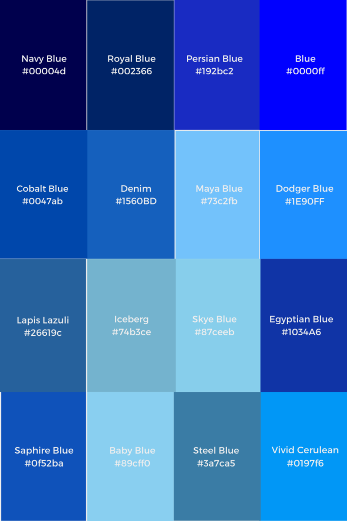
Dull Blue is a specific shade of blue that belongs to the Sky Blue color family. It can be described as having a medium level of brightness and saturation, giving it a muted or subdued appearance. The hex code for Dull Blue is #49759C, and in the RGB color space, it is composed of 29% red, 46% green, and 61% blue components. While it may not be as vibrant as other shades of blue, Dull Blue can still add a touch of sophistication and calmness to any design or color scheme.

The Meaning of Dull Black Color
Dull black is a shade of black that lacks brightness and shine, appearing flat and low in reflectivity. It is a muted, unsaturated tone that can appear almost grayish in certain lighting conditions. Unlike glossy or shiny blacks, dull black lacks depth and dimension, often appearing one-dimensional and lackluster. This color is commonly used in fashion, automotive, and home decor industries to create a more subdued or understated look. dull black is a color that is characterized by its lack of brightness and shine, resulting in a more muted and subdued appearance.
The Meaning of Gloomy Color
Gloomy color refers to hues that tend to evoke feelings of sadness, melancholy, or despair. These colors are often associated with darkness, shadows, and emptiness. Some examples of gloomy colors include dark shades of blue, gray, brown, and black. These colors can be used to convey a sense of mourning or loss, or to create a somber and serious mood. Gloomy colors are often used in art, literature, and music to evoke powerful emotions and create a sense of depth and complexity. However, it’s important to note that the interpretation of gloomy colors can vary depending on cultural and personal associations, and that tese colors may also have positive connotations in some contexts.
The Meaning of Dull Black
Dull Black is a specific color that is characterized by a rich, matte black appearance with a sandpaper-like texture. It is a type of textured powder coat that is made of polyester and has a flat finish. This color is created by applying a layer of powder coating to a surface and then heating it to a high temperature to melt and fuse the powder into a durable and long-lasting finish. The result is a smooth, consistent matte black appearance that is resistant to chipping, scratching, and fading. This finish is commonly used in various applications, such as automotive parts, industrial equipment, and household appliances, to provie a sleek and modern appearance while also offering excellent protection against wear and tear.
The Brightness or Dullness of an Object
Intensity refers to the perceived brightness or dullness of a color. It determines how vibrant or subdued a color appears. Colors with high intensity are bright and vivid, while colors with low intensity are muted and subdued. The intensity of a color can be affected by factors such as lighting, saturation, and contrast. In art and design, the use of different intensities can create depth, contrast, and visual interest. intensity plays a significant role in how colors are perceived and can greatly impact the mood and tone of a design or artwork.
Describing Color Tone
Color tone refers to the overall appearance and quality of a color. It is determined by the hue, saturation, and brightness of the color. The hue refers to the pure color or combination of colors that make up the color. Saturation refers to the intensity or purity of the color, with highly saturated colors appearing bright and vivid, while desaturated colors appear muted and dull. Brightness, also known as value, refers to the lightness or darkness of the color.
Color tone can also be affected by the addition of gray, whih can make the color appear duller and less vibrant. It’s important to be careful when adding gray to a color, as too much can result in a loss of brilliance that is difficult to restore. color tone is an important aspect of color and can greatly affect the mood and emotion conveyed by a particular hue.
Is Eigengrau a Color?
Eigengrau is considered a color. It is a dark gray color that is perceived as the uniform background color in the absence of any light stimulus. While it may not be a traditional color that one would see in a rainbow or color wheel, it is still classified as a color due to its unique visual appearance and the fact that it is perceived as a distinct hue by many people. Eigengrau is also known by other names such as intrinsic gray, dark light, and brain gray.
Conclusion
Dull colors can offer a range of benefits and drawbacks when it cmes to their use in design and decor. While they may lack the vibrancy and energy of brighter hues, dull colors can create a sense of calm, sophistication, and subtlety that can be very appealing in certain contexts. Dull colors like Dull Green or Dull White can offer a sense of balance and neutrality, making them useful for creating a calming atmosphere in a bedroom or living room. However, it is important to use dull colors in moderation, as too much can result in a space feeling dull, boring, or lifeless. By carefully considering the context and purpose of your design, you can use dull colors to great effect and create a space that is both stylish and comfortable.
